This post assumes a basic knowledge of React and Gatsby. Some knowledge of Framer Motion is also helpful, but not necessary.
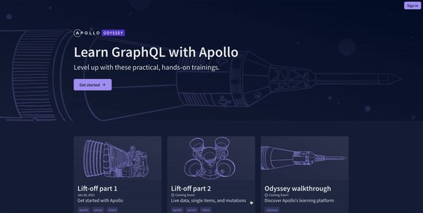
This past week, my team and I at Apollo GraphQL launched our brand new learning platform, Odyssey! To give it some extra UI polish, we used the animation library Framer Motion.
In my last post, I went into the AnimatePresence component and how we can use it to enable both enter and exit animations as a component is being mounted and unmounted. This is the methodology we used for almost all of the page transitions in Odyssey! We navigating between lessons, the content slides either left or right, depending on whether you're moving forwards or backwards in the course. If you're going back to the homepage, we used a fade transition.
The transition animation from the homepage to course details page, however, is noticeably different! On the homepage, we have a list of cards with some info about each of the courses. Clicking on a card navigates to a new page that contains more detailed information about that course. On the route change, the card expands to the details page or shrinks back down to the homepage.
To accomplish this, we used the AnimateSharedLayout component from Framer Motion. Let's dive into how we can use it to accomplish this card effect!
AnimateSharedLayout
The AnimateSharedLayout component allows us to perform layout animations between components that don't otherwise share state OR between components that have the same layoutId prop as they're added or removed from the React tree.
In our case with the card animation on route changes, we're doing a layout animation between components as the smaller card is being unmounted and the course details page is being mounted. As long as those components share a layoutId, Framer Motion will take care of animating them for us!
Structure
To enable these kinds of layout animations, we need to wrap our components with the AnimateSharedLayout component. Since we're using it to handle page transitions, we need to make sure that AnimateSharedLayout wraps all of our pages. In a typical React single page application, we can simply wrap it around our app. For example, if we're using Reach Router to handle our routes, we can import AnimateSharedLayout from Framer Motion and wrap our components. That way when we navigate to a new page, AnimateSharedLayout is never unmounted.
1import React from 'react';2import {AnimateSharedLayout} from 'framer-motion';3import { Router } from "@reach/router";45import Home from "./components/Home";6import About from "./components/About";78const App = () => (9 <AnimateSharedLayout>10 <Router>11 <Home path="/" />12 <About path="/about" />13 </Router>14 </AnimateSharedLayout>15)1617export default App;
Gatsby approach
The approach for using this component with Gatsby is very similar to how we approached using the AnimatePresence component in the last post. Since Gatsby creates pages at build time, we need to make sure that AnimateSharedLayout isn't being unmounted during route changes. To accomplish this, we can utilize the wrapPageElement API in our gatsby-browser.js file in the root of our project.
1import React from 'react';2import {AnimateSharedLayout} from 'framer-motion';34export const wrapPageElement = ({element}) => (5 <AnimateSharedLayout>{element}</AnimateSharedLayout>6);
Now all of our pages will be wrapped in a persistent AnimateSharedLayout component that won't be unmounted as we navigate between different pages.
Layout animation
Now that we have our app set up with AnimateSharedLayout, it's time to animate! To recreate the card expansion animation, we'll need to create a Card component.
1import React from "react"2import { Link } from "gatsby"3import { motion } from "framer-motion"45const Card = ({ item }) => {6 return (7 <motion.li8 layoutId={`item-${item}`}9 style={{10 width: "80px",11 height: "50px",12 borderRadius: "5px",13 backgroundColor: "darkseagreen",14 listStyle: "none",15 textAlign: "center"16 }}17 >18 <Link to={`/page-${item}/`}>19 <p>Item #{item}</p>20 </Link>21 </motion.li>22 )23}
In our Card component, we imported motion from Framer Motion and made our entire card a motion component. Then, we passed it a layoutId. When we click on the card to navigate to its linking page, if there is a motion component on that page with a matching layoutId, Framer Motion will animate the transition between the two.
Now we need to make some pages for our cards to route and animate to. You can set up your pages to look however you want. In order to see a layout animation, make sure to import motion from Framer Motion, create a motion component, and give it a layoutId that matches the layoutId of its card from the HomePage.
Demo
Here's a basic example putting it all together:
In an effort to make the code simpler, I decided to forego adding more styling and animations to fade in and out the page content that lives outside of the card to make the whole page transition a bit smoother. Feel free to experiment with both AnimateSharedLayout and AnimatePresence to make some beautiful page transitions.
Summary
Pretty cool, huh? Let's recap what we had to do:
- Wrap our pages in
wrapPageElementwithAnimateSharedLayout - Create some sort of card component on one page that is a
motioncomponent with alayoutIdthat links to another page in our app - Create a separate page for our card to link to that has a
motioncomponent with alayoutIdthat matches its card
Framer Motion gave us that nice animation right out of the box! No extra configuration was required for the animation. You can go deeper with your layout animations and combine AnimateSharedLayout with AnimatePresence to make some really neat effects. As always, be sure to check out the docs! If you make something cool with Framer Motion, let me know on Twitter! I'd love to see what you're making 😄