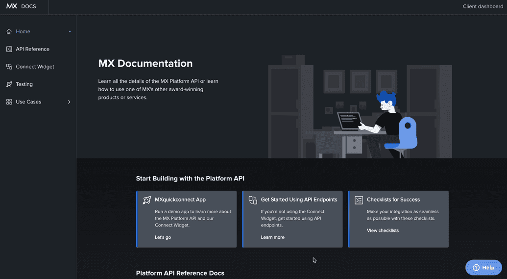
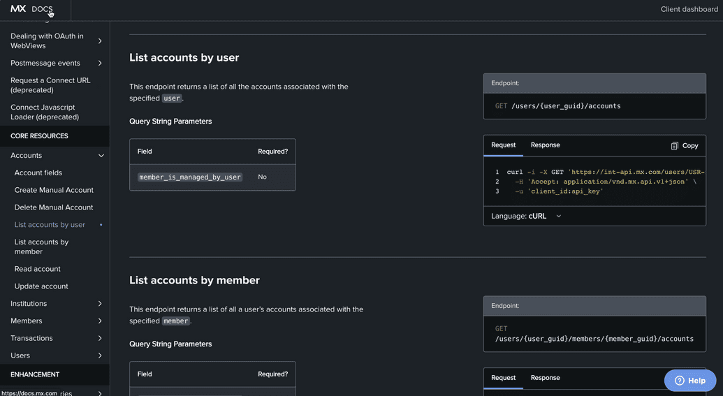
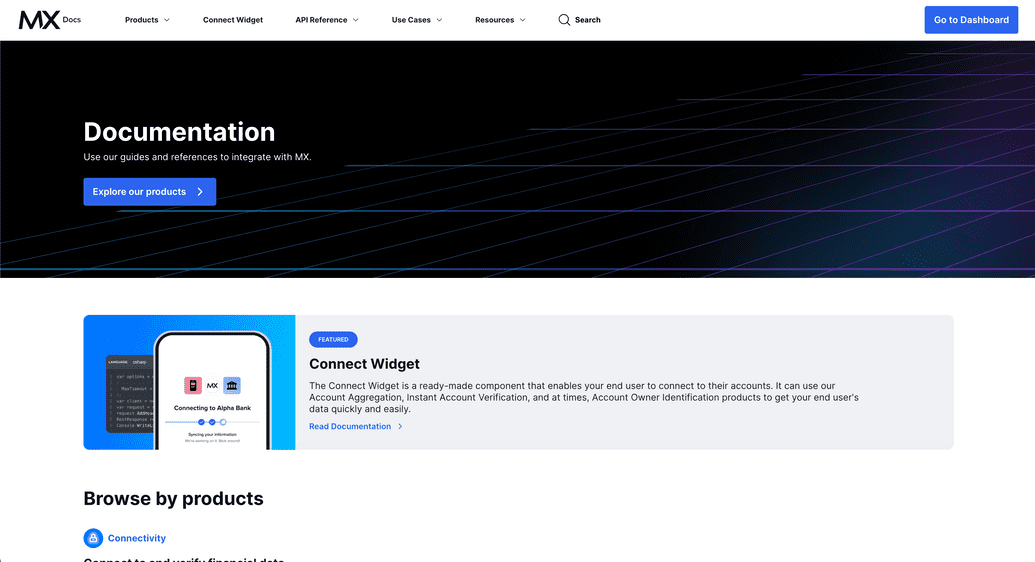
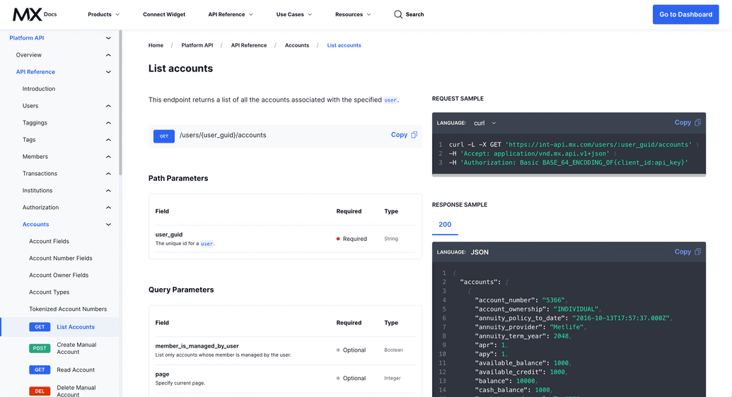
Today the developer experience team at MX launched a new documentation site for MX's various products and API's. Take a look at the before and after of the site below:
The result
Before
The old docs site lacked any sort of search functionality, and the information architecture was not very intuitive. Clients had a difficult time finding the information they needed.
The API reference page was particularly problematic. All of the documentation was in a single page, and with the way that the code was architected, the page was too large for most mobile browsers to handle and would often crash.
After
The new docs site underwent a design refresh and is much more user friendly and intuitive. It has a header and sidebar navigation that allow users to easily navigate to the information they need. It also has a search bar that allows users to search for specific terms or phrases. The search functionality is powered by Algolia, which provides a fast and accurate search experience.
The API reference page is now broken up into multiple pages, which makes it load more quickly and makes it easier to navigate and read. Information about each endpoint is also more detailed, which makes it easier for clients to understand how to use the API.
The team
Marla Kohn, Nadia Bahash, and I have been hard at work on this project for the past few months. Marla directed product requirements, Nadia led design, and I headed up development as the lead engineer.
The problem
The previous documentation site was an outdated CRA React app that was built several years ago. It was difficult to maintain and update, and was not very user friendly. Technical writing often had to write raw HTML, which was cumbersome and error prone. The UX/UI was also hard to navigate, with an unintuitive information architecture and a lack of search functionality. And as discussed previously, the API reference page was particularly problematic and would often crash for mobile browsers.
The solution
As the lead (and only) engineer on this project, I brought in a lot of learnings from previous educational projects I worked on at Apollo GraphQL.
Here's the tech stack I chose:
- Docusaurus / React
- MDX
- Tailwind CSS
- Algolia (search)
- NodeJS (custom build-time scripts)
I knew that I wanted to use a React framework that could help us hit the ground running quickly. Docusaurus is a well maintained framework designed specifically for documentation sites. It provides a lot of functionality out of the box, including a sidebar navigation and versioning support. It also has a plugin ecosystem that allowed us to add features like Algolia search and analytics.
I also wanted to provide the technical writing team with a way to write documentation that was easier than raw HTML. One of the product requirements was to have a "docs like code" experience where the documentation content lived in MX's GitLab and had git versioning. I decided to use MDX, a flavor of Markdown, to provide a simpler authoring syntax and allow us to use custom React components in our documentation. I'm hoping to get buy-in to add a headless, git-based CMS in the future to further simplify the authoring process and reduce the barrier to entry for technical writing.
For styling, I wanted to use a CSS framework that would allow us to build and iterate quickly, and provide a consistent look and feel across the site. I chose Tailwind CSS because it's a utility-first framework that allowed us to build quickly and it plays very nicely with static sites.
Features and improvements
A new feature of this site is the search functionality. I chose to use Algolia because it's a well maintained search service and another team at MX was already using it. I had previously built out a search solution using Algolia during my time at Apollo, so I was able to quickly build out both the search UI and the script to parse the content to create records in Algolia.
I also successfully proposed and implemented a solution to allow the docs site to be an exception to MX's typical QA process. Because the docs site does not contain any sensitive information (like many other MX products), I was able to collaborate with the devops team to allow us to deploy directly to production without going through the more rigorous QA process. This allowed us to iterate quickly and get the site launched in a timely manner. Instead, we implemented an automated CI/CD pipeline in GitLab that runs on every merge request before merging to main. This pipeline runs tests and validates that the site builds successfully before merging and deploying to production. Each merge request was also set up to create a unique preview environment to make the review process easier.
This was a huge win for the team and allowed us to iterate quickly and get the site launched in a timely manner. Reviews are more accurate and efficient because the reviewer can see the changes in a live, production-level environment instead of a static screenshot or needing to pull it down to their local machine. It also allows us to get feedback from any stakeholders and other teams before merging to main and deploying to production.
Skipping the traditional MX QA process and deploy pipeline removed a lot of friction and allows technical content updates to be deployed in a matter of minutes instead of waiting in the company QA queue for several days.
Personal takeaways
This was a really fun project to work on. I was able to dive deep in a lot of different technologies and learn a lot along the way. I'm really proud of the work that the team did.
As the lead engineer for this project, I was responsible for the technical decisions and implementation. Before any development started, I explored several possible options for React frameworks and off-the-shelf solutions that MX had approved. I built a couple of quick POC's and wrote a document listing the pros and cons of each and ultimately why I *recommended Docusaurus. I also outlined the technical architecture of the site and how it would be deployed with MX's current infrastructure.
*At the time, there was a miscommunication around just how much custom design and styling that Product wanted. It started off as "we just want to be able to have our logo and colors on it. The rest can be off-the-shelf", but turned into a fully custom design and layout. There are also whispers of making the docs much more dynamic and tailored to individual clients. If I had known that we would be doing a lot of custom design (and potentially user-based content and components), I would have recommended a non-static React framework instead of Docusaurus. I should have made sure Product had a clear picture of what they wanted re: design before making my recommendation.
I was also responsible for communicating with the team and stakeholders about the progress of the project. I kept a running document that I updated weekly to demonstrate in less technical terms, with pictures and screen recordings, what work had been accomplished that week. Keeping this project documented significantly reduced the number of synchronous meetings that were had, where the goal was to just give product updates, and allowed me to focus on the actual work.
I learned a lot about how to communicate effectively with a team with diverse skills and responsibilities and how to manage expectations. I've had to get comfortable standing my ground and pushing back when unrealistic expectations or feature requests are made. I also learned a lot about how to make technical decisions that balance the needs of the team and the needs of the project, making weighed tradeoffs when necessary to balance speed, maintainability, and scalability.
Working with Marla and Nadia has been a wonderful experience. They both communicate well and are very organized. We all work well together and take and give feedback openly. I'm really proud of the work that we did and it's exciting to see how it has already improved the lives of MX's clients.
Other exciting features
I'm extremely proud of the fresh design, the new search functionality, and the new API reference documentation. I had some fun building a couple of different types of tables and code block components that give technical writing lots of options for different kinds of layouts and functionality. But there are other features that I'm proud of that aren't as visible to the end user.
Some of the features I built are much heavier on the "backend" side of things, but I'm just as equally proud of them as the frontend features. Here are some of the ones that I'm most proud of:
- Custom remark plugins to parse and transform the MDX content. One that I'm particularly proud of, due to its complexity, is the table of contents plugin. The out-of-the-box Docusaurus plugin that generates the table of contents has a known limitation for not accounting for any imported MDX content on a page. So I wrote a custom plugin that would parse the MDX content, looking for any imported MDX content, and generate a more accurate table of contents that would include headings from the "parent" page and all of its imported content.
- A Node script to parse the MDX content to create records and add them to MX's Algolia indices. Like the plugin mentioned above, this script was written in such a way as to handle imported MDX content and include those in the Algolia records.
- A Node script that is executed in a pre-commit command to check if the OpenAPI specification file(s) has been changed and staged to be committed. If it has, the script will run a function that autogenerates the API reference documentation so that it is up-to-date. This script is also run in the CI/CD pipeline to ensure that the API reference documentation is always up to date both locally and in production.
Up next
We're not done yet! Here's what's next for the docs site:
- Wrapping up loose ends for the responsiveness of the site. The header breakpoints had some hardcoded limitations from Docusaurus, so design went back to the drawing board to come up with a solution that would work within the constraints.
- An updated layout for the search UI, based on client feedback and analytics, that will add a "preview panel" alongside the list of results.
- Versioned documentation for API reference docs so that documentation for older versions of MX's API are still available for clients who are using older versions.


